
Psychology of Color In today’s digital world, first impressions happen in seconds. Before a visitor reads your content, explores your services, or makes a purchase decision, they subconsciously react to your brand’s visual identity. One of the most powerful elements of that identity is color.
At Traders Junction, we understand that branding is more than just a logo—it’s about creating trust, recognition, and emotional connections. Choosing the right color palette can influence user behavior, improve engagement, and ultimately increase conversions.
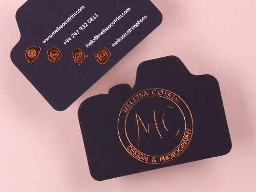
Read More About Color By Shape
Why Color Psychology Matters
Color psychology is the study of how colors affect human emotions and decision-making. Different colors create different feelings, which is why successful brands carefully select palettes that align with their goals.
Research suggests that people often form an opinion about a brand within moments, and color plays a major role in that perception.
Common Color Associations
- Blue – Trust, reliability, professionalism
- Green – Growth, success, financial stability
- Red – Energy, urgency, excitement
- Orange – Confidence, creativity, action
- Black – Luxury, authority, sophistication
- Purple – Innovation, wisdom, premium quality
For trading, finance, and investment-related businesses, colors that communicate trust and growth are often the most effective.
How Colors Influence Website Conversions
The right color palette can guide users through your website and encourage them to take action.
Building Trust
Visitors are more likely to engage with a website that looks professional and credible. Blue and green tones are commonly used in financial and trading platforms because they create a sense of security and confidence.

Color By Finish
Improving User Experience
A balanced color scheme improves readability and helps users navigate your website more easily. Clear visual hierarchy keeps visitors focused on important information.
Encouraging Action
Strategic use of accent colors can make call-to-action buttons stand out. Whether it’s “Join Now,” “Start Trading,” or “Learn More,” the right contrast helps increase click-through rates.
Popular Palette Styles That Convert
- Trust & Stability Palette
Blue + White + Gray
This combination is ideal for financial services, trading platforms, and professional businesses. It creates a clean and dependable image that encourages user confidence.
- Growth & Success Palette
Green + White + Navy
Green symbolizes growth and prosperity, making it a strong choice for investment and trading brands. Combined with navy blue, it balances optimism with professionalism.
- Premium Authority Palette
Black + Gold + White
Perfect for premium services, exclusive memberships, and high-end financial consulting. This palette communicates expertise and prestige.
- Modern Innovation Palette
Purple + Blue + White
Brands focused on technology, fintech, and innovation can benefit from this modern and forward-thinking color combination.

paper color
Choosing the Right Palette for Your Brand
Selecting a color palette shouldn’t be based solely on personal preference. Consider the following factors:
Understand Your Audience
Different audiences respond differently to colors. A professional trading audience may prefer clean, trustworthy tones, while younger users might engage more with vibrant and energetic designs.
Match Your Brand Values
Your colors should reflect what your company stands for. If your goal is to inspire confidence, choose calming and professional tones. If you want to communicate innovation, experiment with modern color combinations.
Maintain Consistency
Use the same primary and secondary colors across your website, social media profiles, marketing materials, and branding assets. Consistency improves recognition and builds trust.
Color Trends in Modern Trading Websites
Many successful trading and fintech brands are moving toward:
- Dark mode interfaces with vibrant accent colors
- Blue and green combinations for trust and growth
- Minimalist designs with strong contrast
- Clean white space for improved readability
- Simple call-to-action buttons that stand out naturally
These trends not only look modern but also improve user engagement and overall website performance.
Final Thoughts
Color is much more than a design choice—it’s a business strategy. The right palette can shape perceptions, build credibility, and influence customer decisions from the moment they land on your website.
At Traders Junction, we believe that effective branding combines psychology, design, and user experience to create meaningful results. By choosing colors that align with your audience and business goals, you can create a stronger brand identity and turn more visitors into loyal customers.